


The dataset can viewed and downloaded from here.
Steps to follow
To perform an Exploratory Data Analysis (EDA) on the dataset, we will follow these main steps:
1. Data Inspection
2. Data Cleaning
3. Data Visualisation
4. Hypothesis Testing
Step 1: Data Inspection
Data inspection is the first step in any analysis, whether the goal is to build models or perform an EDA, as in our case.
The aim is to examine different aspects of the data to identify any issues that need attention during the cleaning process.
Think of it as a check-up done by doctors before making a diagnosis or prescription.
Importing Necessary Libraries
For this analysis, we’ll primarily use `pandas` for data manipulation, `numpy` for numerical operations, and `matplotlib` along with `seaborn` for data visualisation.
Loading the Data
Using the pandas library, you can easily load data with functions like read_csv, read_excel, etc., depending on the file format. Since our dataset is in CSV format, we’ll use the read_csv function to load it.
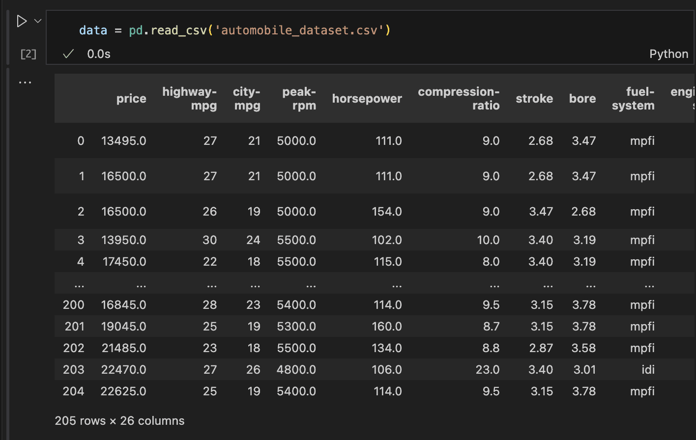
In the code above, we could see the number of rows and columns, but there’s more we need to investigate.
How many columns have missing values? How can we view all 26 columns and understand what they represent?
Accessing the columns
To get a comprehensive overview of the dataset, including details like the data types, number of non-null entries, and column names, we can use the info() method in pandas.
This method provides everything we need to know about the dataset at a glance.
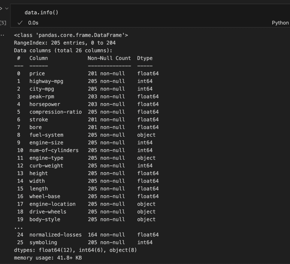
In the code above, we could partially access the dataset’s features. However, not all columns were listed.
From those displayed, we can identify columns with missing values, the data types of each column, and the memory usage.
It can be observed that 12 columns are of float data type, 6 are integers, and 8 are strings/objects. This means that 18 columns are numerical, while 8 are categorical or ordinal.
Dealing with Null values
Dealing with null values is essential and cannot be avoided. For example, out of the 205 total rows, the price column has only 201 non-null entries, horsepower and peak-rpm have 203, and stroke and bore have 201, among others.
To get a clearer picture, we can use the isna() method followed by sum() to return the number of null values in each column.
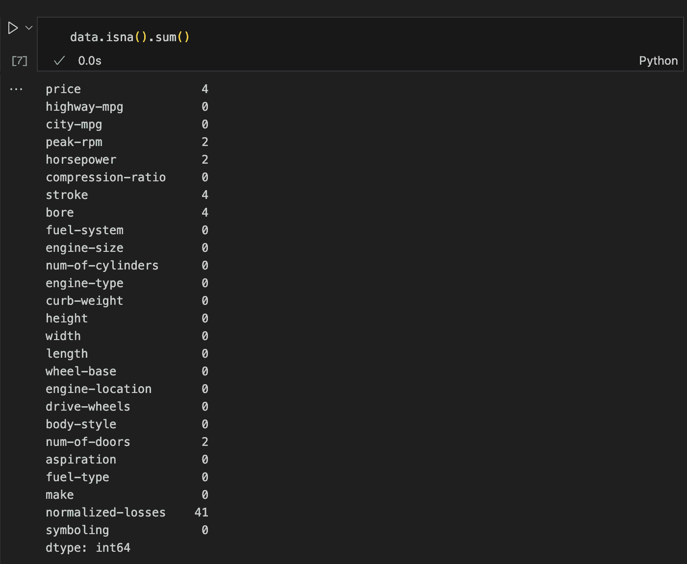
This method reveals everything we need to know about missing values, showing that we need to address seven columns in total.
Duplicate Rows
Another important aspect to check is the presence of duplicate rows. Thankfully, Pandas makes this process simple.
By using the duplicated() method followed by sum(), we can quickly determine the total number of duplicate rows in the dataset.
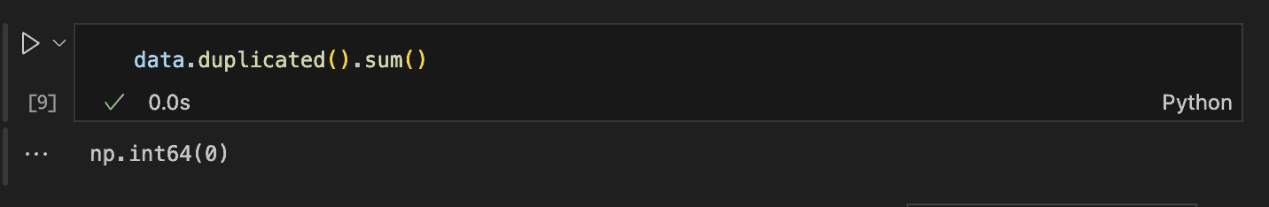
Since the return value is 0, we can confidently say that there are no duplicate rows in the dataset.
Statistical Representation of Data
To carry out this assessment, the describe() method in Pandas provides an easy way to view key statistical values for all numeric features. See the code and result below for an example.
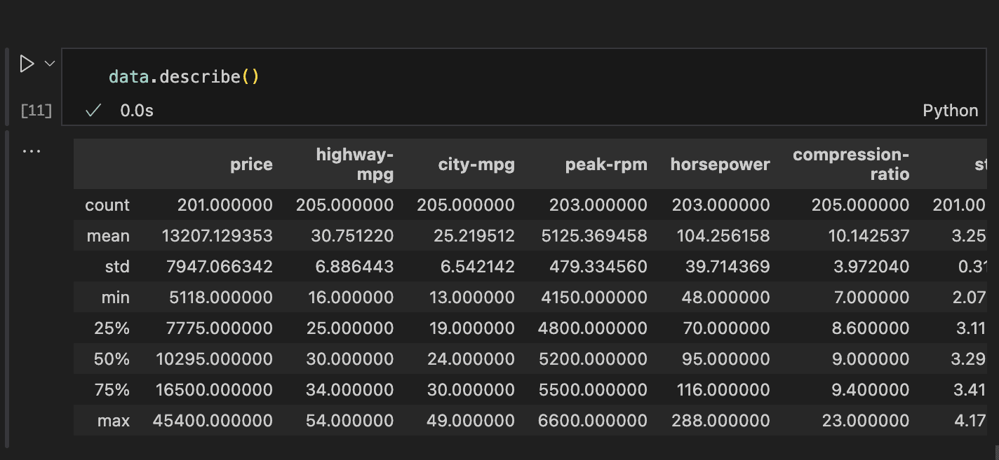
Information about the count, mean, standard deviation, min, 25-percentile, 50-percentile (median), 75-percentile, and maximum value for each column can be easily accessed.
This information reveals that most features might have distributions close to normal and hence has no outliers. That can be verified using an histogram and box plot.
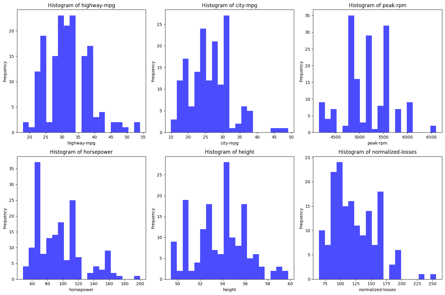
From the histograms above, none of them seem to perfectly follow a normal distribution. Here’s a quick analysis of each:
- highway-mpg: This distribution appears bimodal (two peaks) rather than normally distributed which is bell shaped. The bimodality suggests two distinct group which could be a group of fast cars and less fast cars.
- city-mpg: Similar to highway-mpg, this distribution is not normally distributed. It also appears bimodal with two peaks.
- peak-rpm: This histogram is quite irregular with a few prominent peaks, suggesting that the data is skewed and not normally distributed.
- horsepower: The distribution is skewed to the right, meaning there are more data points with lower horsepower, and the tail extends towards higher horsepower values. This is not a normal distribution.
- height: The height histogram is the closest to a normal distribution. It is not perfectly normal but it is pretty close.
- normalized-losses: This distribution shows a right skew, where most data points are concentrated on the lower side and a long tail stretches towards higher values. This is also not normally distributed.
Normal distribution have various characteristics which includes equal mean and median, a bell shaped distribution which also means they are symmentric and therefore has no skew and finally, no outliers.
It is a good approach to verify fully.
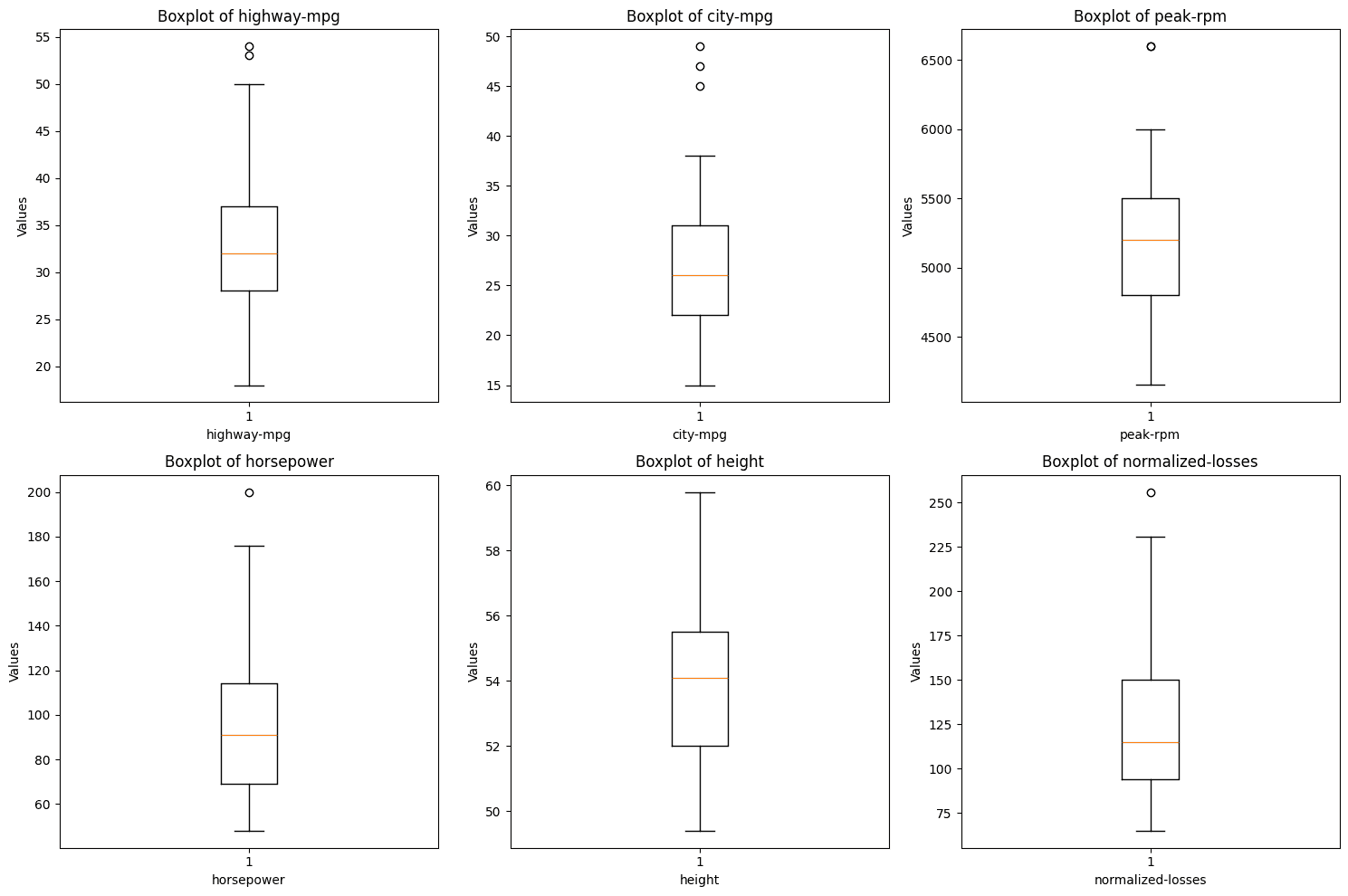
The boxplots above reveals that some of the variables consist of outliers. The points outside of the whiskers of the plots are outliers and even though they are not many, they need to be dealt with.
From the perusing step, we know we have to deal with missing data, and outliers.
Step 2: Cleaning the data
Data cleaning involves preparing the data in a way that makes it suitable for analysis.
Sorting Out Missing Rows
From the previous step, we know there are missing values in the price, num-of-doors, peak-rpm, horsepower, stroke, bore, and normalized-losses columns.
While we can replace these with the mean or median based on statistical reasoning, it’s important to also consider the context.
For instance, if a feature is specific to a certain manufacturer, it might be more appropriate to fill in missing values with what’s common for that manufacturer.
First, let’s assess the rows with missing horsepower values to decide the best approach for filling them in.
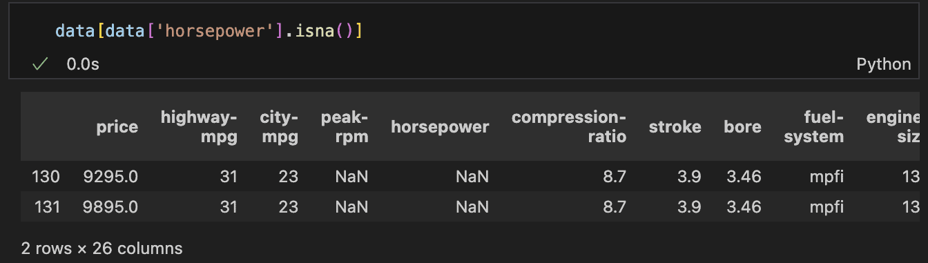
– Horsepower and peak-rpm
There are two rows where both horsepower and peak-rpm are missing. A closer look reveals that these rows belong to the same car brand, and notably, these are the only two records for that manufacturer in the dataset.
This indicates that there are no historical values to reference, making it inappropriate to simply use the average or median of the entire column.
This is because a car’s horsepower is influenced by various factors, including the manufacturer.
In a real-world scenario, with insufficient data and an inability to afford losing more rows, the best option would be to research the car brand.
The dataset contains details like the number of doors and the body style (e.g., wagon or hatchback), which could help identify the specific model or a similar one to estimate the missing horsepower.
However, in this case, we will drop these rows. In addition, it’s worth noting that the normalised-losses—which represent the historical losses incurred by an insurance company for a specific car, after being normalised—are also missing.
Since normalised losses are crucial in this analysis, we will exclude rows without this data. If this were a modeling problem, we might consider training a model to predict these losses, and then use the model to estimate the missing values.
– Stroke and bore features
Next, let’s discuss the stroke and bore features. The bore refers to the diameter of the engine’s cylinders, measured in inches. Larger bores allow for larger valves and increased airflow.
The stroke, on the other hand, is the distance the piston travels inside the cylinder, also measured in inches. Longer strokes generally provide more torque.
There may be a correlation between these features and the normalised losses, making them potentially important.
Upon inspecting the rows with missing stroke and bore, we find that four rows are missing both features.
These rows correspond to cars from the Mazda brand. We should look into historical records for Mazda to determine the typical values for stroke and bore in their vehicles.
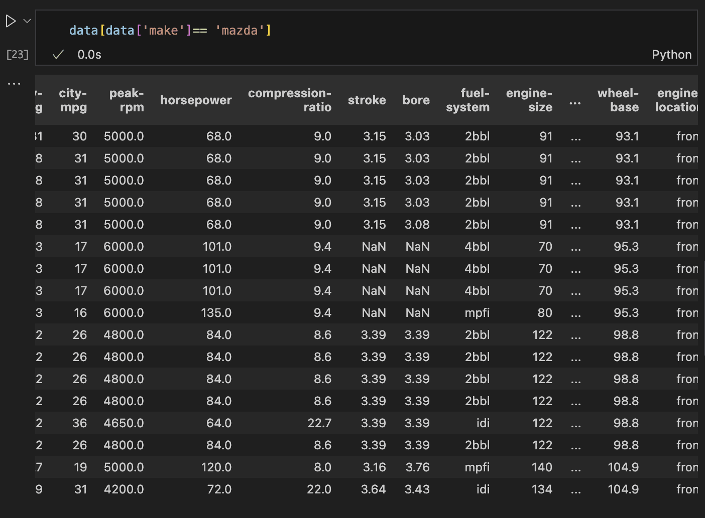
The code and result above confirms that historical data is available. While the best approach would be to conduct research, a viable alternative is to replace the missing values with the average values from similar records.
This ensures the replacement values stay within a realistic range. To proceed, we first calculate the average stroke and bore values for Mazda vehicles in the dataset.
Once we have these averages, we can replace the missing values accordingly. This can be done by grouping the data by the car manufacturer and then computing the average for the stroke and bore columns.
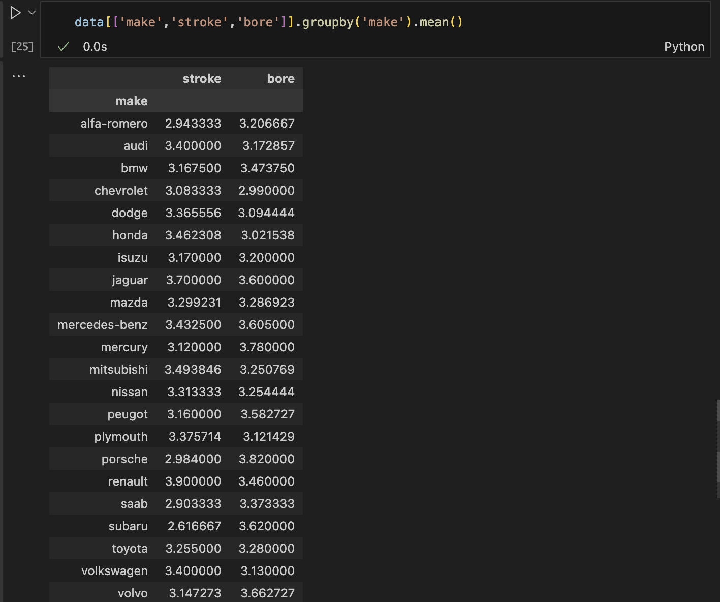
The mean values for Mazda’s stroke and bore are approximately 3.3, rounded to the nearest decimal.
We can replace the missing values (NaN) with these averages. We can apply the same strategy for the missing prices.
First, we identify the rows with missing prices, check the car brands, and then decide the best course of action.
There are three different car brands with missing prices, which also have their normalised losses missing. Since our analysis focuses on normalised losses, we’ll drop rows with missing normalised losses for this analysis.
Handling outliers
Regarding outliers, there are various approaches to handling them depending on the dataset’s intended use. When building models, one option is to use algorithms that are robust to outliers.
If the outliers are due to errors, they can be replaced with the mean or removed altogether.
In this case, however, we will leave them as they are. This decision is based on their scarcity across variables, which allows us to retain all instances in the data.
The outliers are not erroneous; in fact, having more data would enable us to capture a broader range of their instances.
With that decided, let’s proceed with the data cleaning:
- First, remove all rows with missing normalised losses. This will also handle rows with missing prices and horsepower.
- Then, fill in the mean stroke and bore values for Mazda only.
- Finally, print the sum of all remaining null values to confirm the cleaning process.
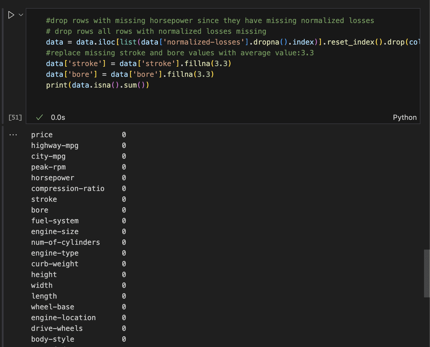
This leaves us with zero missing values in each row.
Drop Unnecessary Columns
At this point, it’s crucial to be clear about the focus of the analysis and remove irrelevant columns.
In this case, the analysis is centered on understanding the features that influence normalised losses.
With a total of 26 columns, we should drop those that are unlikely to contribute to accidents or damage.
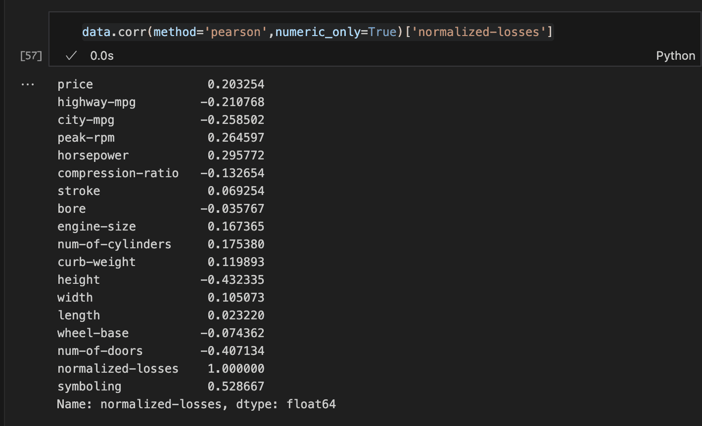
A straightforward approach is to examine the correlation of the numeric features with normalised losses. This can be easily done using the Corr method.
Step 3: Visualising the data
To effectively perform data visualisation, we can formulate key questions that need answers:
Some examples can be:
- Does a certain body type,fuel type or aspiration lead to increased insurance loss?
- What is the relationship between selected features and normalised losses?
To answer the question about body type, we can analyze the relationship between body type and normalised losses. Here’s how:
- Select the body-type and normalised losses columns.
- Group the data by body-type and calculate the mean normalized losses for each group.
- Use Seaborn’s barplot to visualize the mean normalised losses by body type.
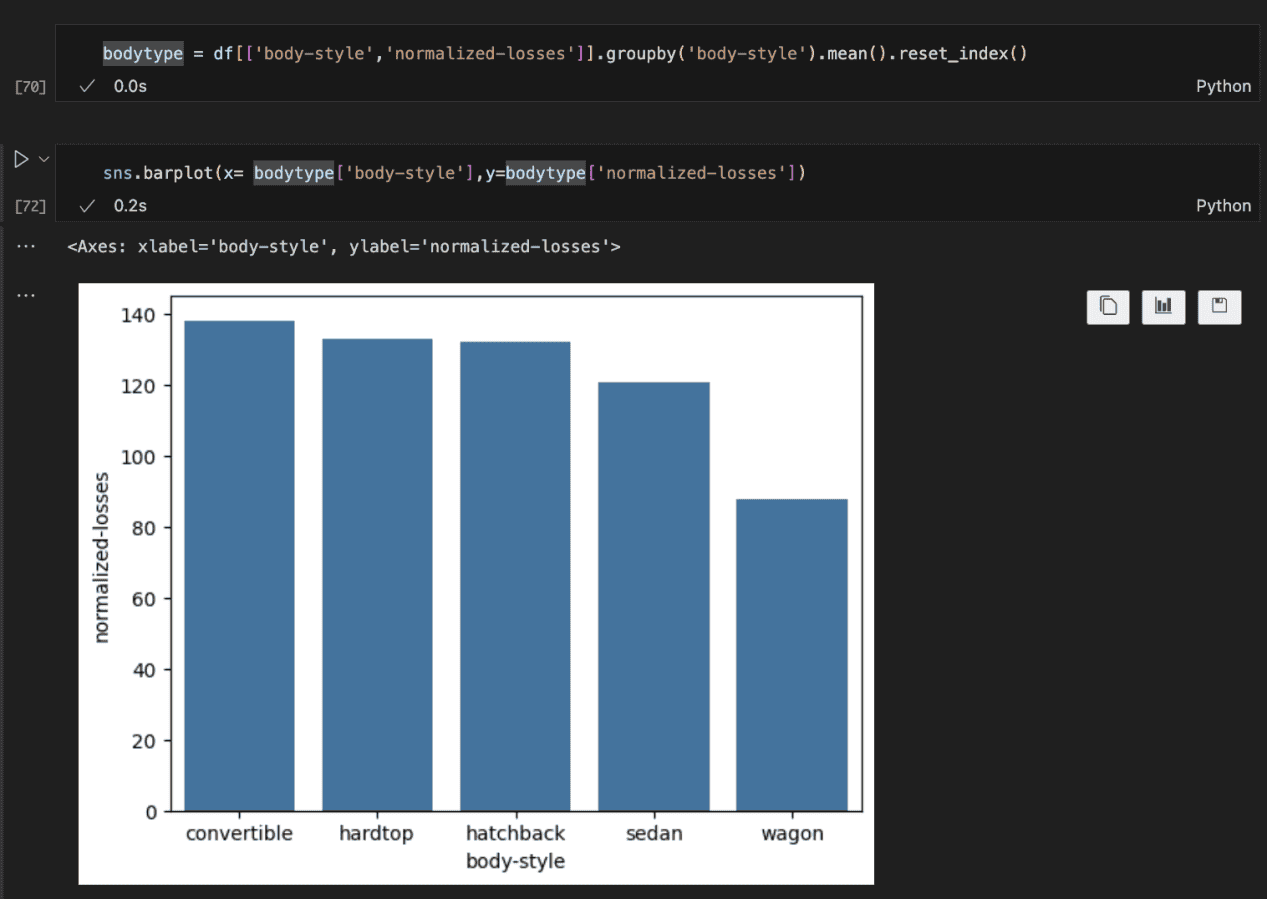
The plot above shows that mean losses indeed vary based on body type. Convertibles have the highest average amount paid for losses by insurance companies, while wagons have the lowest.
I suspect it is due to the fact that convertibles tend to be sport cars and as such built for speed. This can lead to more accidents and more reasons to higher insurance pay.
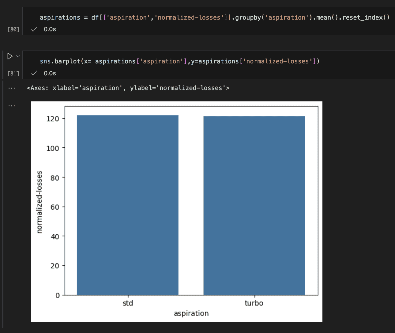
The picture above shows whether or not a car is standard (naturally supercharged) or as turbo has no effect on the losses. I find this surprising.
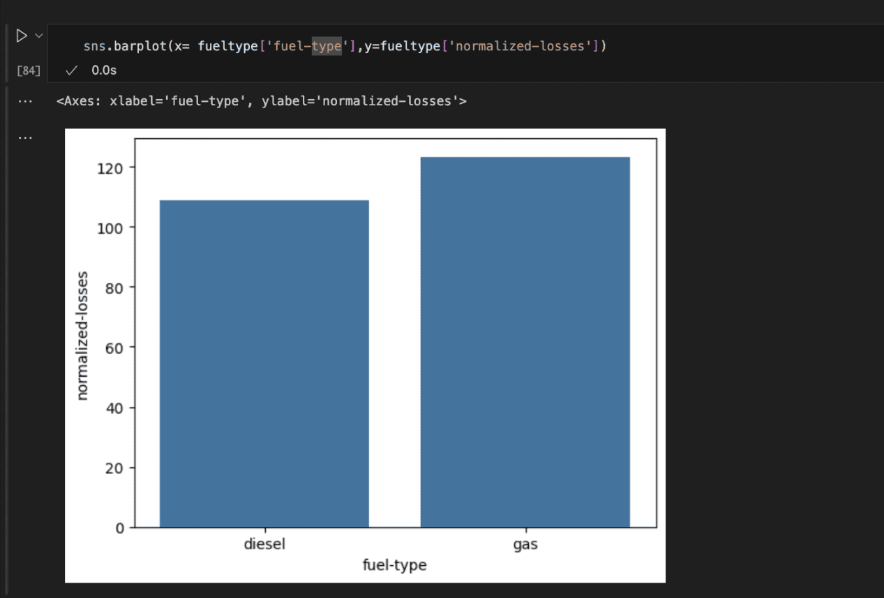
Checking the fuel type reveals that cars running on gas incur more losses for insurance companies than diesel-powered vehicles.
This could be because gas-powered cars often provide better acceleration, leading drivers to push them harder and potentially increasing the likelihood of accidents.
The next form of analysis is to check the relationship between numerical features.
The subplots below show the relationship between selected features and normalised losses.
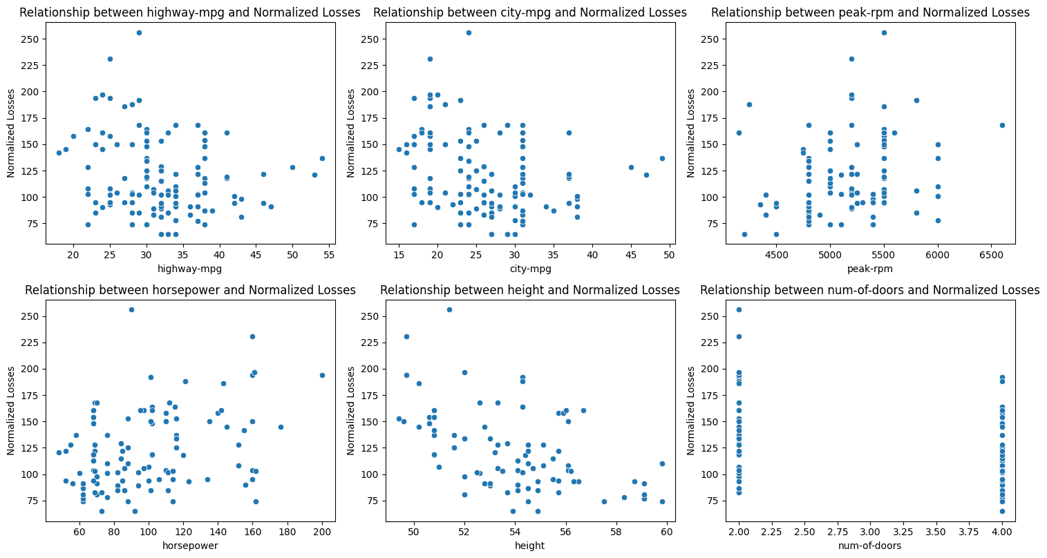
Key Takeaways:
- Fuel Efficiency: There is a slight positive correlation between a car’s fuel efficiency in both city and highway driving and the normalised losses.
- Engine Performance: The engine speed at which maximum horsepower is produced (peak RPM) shows a slight positive correlation with normalised losses. In addition, there is an even stronger positive relationship between horsepower and losses. Higher horsepower often leads to faster acceleration and higher top speeds, which can increase the likelihood of accidents and, consequently, more damage.
- Car Height: Taller cars tend to incur fewer losses. This is an example of negative correlation. It might be due to better visibility and enhanced crash protection offered by their taller roofs, particularly in certain types of collisions.
- Number of Doors: There is a moderate positive correlation between the number of doors and normalized losses, with cars having fewer doors (typically two-door cars) incurring more losses. This could be because many two-door cars are sports cars, which are often driven more aggressively.
Step 4: Hypothesis Testing
While visualisations can suggest potential positive relationships, it’s important to test the statistical significance of these relationships.
Are the features truly correlated, or is it just due to chance?
When performing significance tests, several factors must be considered. These include the type of data (e.g., numerical vs. categorical, numerical vs. numerical), the normality of the data, and the variances, as many statistical tests rely on specific assumptions.
In this case, we are comparing our numerical variables with the normalised losses using Spearman’s Rank Correlation since the data distribution is not normal.
Let’s define our hypotheses:
Null Hypothesis (H₀): There is no correlation between the two variables.
Alternative Hypothesis (H₁): There is a correlation between the two variables.
We set the significance level (alpha) at 0.05. If the p-value is less than alpha, we reject the null hypothesis and conclude that there is a significant relationship.
However, if the p-value is greater than alpha, we fail to reject the null hypothesis, meaning no significant correlation is found.
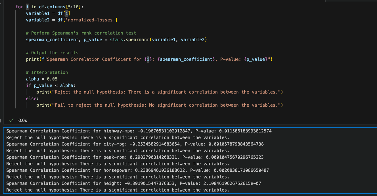
Based on the image above, the results indicate that our assumptions are statistically significant, and for each variable, the null hypothesis is rejected.
Conclusion
From the analysis, it is evident that certain factors related to a car’s stability and acceleration capabilities often lead to increased insurance losses.
This comprehensive analysis covered various approaches to data wrangling and visualisation, uncovering valuable insights.
These findings can aid insurance companies in making more informed decisions, predicting potential losses associated with specific car models, and adjusting their pricing strategies accordingly.